
Sticker design is unique—it blends graphic design and surface design into one compact format. The “surface” just happens to be vinyl. Or as professional sticker designer Amanda Weedmark puts it:
“Sticker design is an alchemy of eye-catching creativity and technical details that come together to create a traveling piece of art that can add personality to almost any surface.”
If you're ready to take your designs to the next level, understanding the principles of design is where it starts.
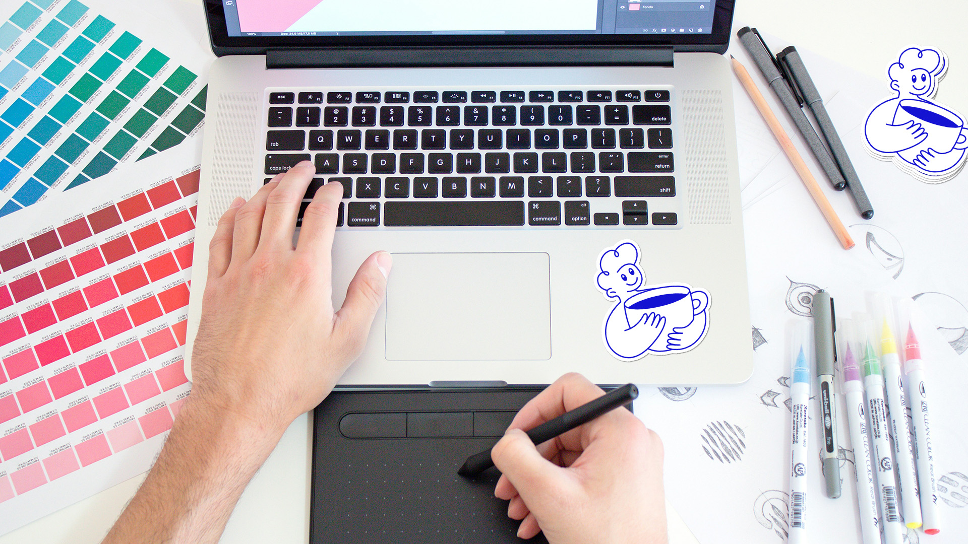
Photo by Theme Photos on Unsplash
Design Principles and Fundamentals
Every great design—whether it’s for a logo, t-shirt, poster, or sticker—follows foundational design principles. These aren’t rigid rules, but they act as creative checkpoints that can help your designs resonate more effectively with your audience.
Core Principles of Design:
- Contrast
- Balance
- Emphasis
- Proportion
- Hierarchy
- Repetition
- Rhythm
- Pattern
- White Space / Negative Space
- Movement
- Variety
- Unity
Keep in mind: you don’t have to choose just one principle. Many strong designs combine several at once. The key is learning to evaluate your design through these lenses. Are your colors overwhelming the message? Is the text legible? Are you using too little contrast?

Designing for Stickers: What to Know
Sticker design has its own unique technical considerations, especially when printing on vinyl. Here are a few things to keep in mind when preparing your artwork:
- Use high-resolution files: Always design at 300dpi minimum to ensure sharp prints at full size.
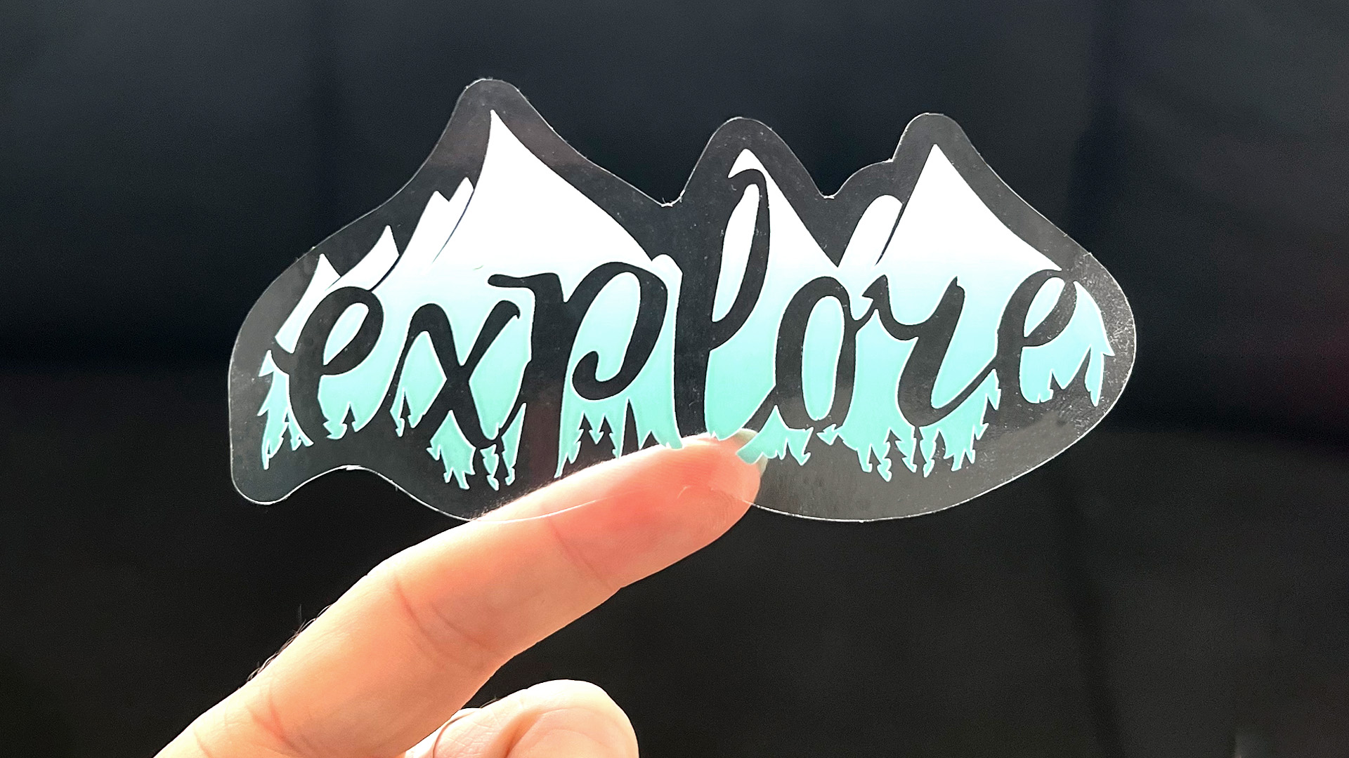
- Utilize specialty materials: If you’re using clear, glitter, or holographic vinyl, use negative space to let the material shine through. Make those features part of your design—not just a background.
- Choose the right cut: If your design has a clean outer edge, a die-cut sticker is perfect. But if your artwork has tiny edges or intricate points, consider a kiss-cut sticker to make peeling and applying easier for your customers.
- Be mindful of transfer sticker details: For single-color vinyl transfer stickers, every piece of excess vinyl that needs to be “picked” (weeded out) adds to the production time and cost. Complex designs with many small interior cuts may also frustrate customers during application.
Understanding “Picks” for Transfer Stickers:
In transfer stickers, a “pick” refers to removing excess vinyl to isolate the intended shapes or letters. Each pick is labor-intensive, and if your design has hundreds of tiny details, it may increase the cost and difficulty of application.
How to Add a Cut Path
For JPEG or PNG Files:
- Open the Swatches panel in Illustrator.
- Create a new spot color swatch called “Cut Contour 2” (no spaces).
- Duplicate the image (Paste in Place), then run Image Trace to convert it into a vector.
- Expand the vector and outline the stroke.
- Use Pathfinder to merge shapes and create a single outline.
- Change the stroke to the Cut Contour 2 swatch.
For Vector Files (EPS or AI):
- Select the artwork layer.
- Use Offset Path to create an outline slightly larger than the original design.
- Merge and unite all paths using Pathfinder.
- Set the stroke color to the Cut Contour swatch.
What Is a Spot Color?
Spot colors are pre-mixed inks used in printing for consistency and specialty effects—like metallics, fluorescents, or precise brand colors. But in sticker production, spot colors also serve functional roles:
- “Spot1” tells the printer where white ink should print (especially on clear or metallic stickers).
- “CutContour” or “Cut Contour 2” tells the plotter where to cut the design.
These swatches aren’t printed—they’re interpreted by the machine during production. Think of them as invisible instructions written into your file that guide the printing and cutting process.

What Does “Print-Ready” Mean?
Print-ready artwork means the file you upload is the exact size, color space, and resolution needed for clean, high-quality output. At CarStickers.com, we print in full color up to 1000dpi. Here’s what to double-check before sending in your file:
Common File Issues to Avoid:
- Document not sized properly.
- Colors set to RGB instead of CMYK.
- Spot colors not correctly defined.
- Resolution too low (should be 300dpi at full size).
- Missing fonts or linked images.
- Poor contrast between background and text.
- Spelling or grammar errors in your design.
If your file meets all these standards, it’s ready to hit the press. Not sure if it’s perfect? We’re happy to review your artwork before printing!
Final Thoughts
Designing stickers combines creativity and precision. Whether you’re designing for fun, for your brand, or to sell as merch, understanding the principles of design and production will help your stickers look—and perform—their best.
Need help getting your file print-ready? Check out our video guide or reach out to our team. We’re here to help your design shine—on any surface.


