
For many small businesses, artists, and makers, the fourth quarter is the busiest selling season of the year. In fact, holiday sales can account for 30–40% of a consumer brand's annual revenue, making fall the perfect time to fine-tune your products, branding, and marketing before the holiday rush according to Target Accelerators.
It's also no secret that fall and winter markets have exploded in popularity over the past decade. While craft fairs and farmers markets used to feel like a summertime tradition, today you'll find bustling holiday markets, pop-up events, and maker fairs throughout the cooler months. They're the perfect place to sip hot apple cider, browse handmade fall décor, discover local artists, and find one-of-a-kind holiday gifts.
"People love when a lot of interesting, fun, delicious, and beautiful things are concentrated in the same place that we can easily navigate on foot. It's human nature to like places like this because they're stimulating and entertaining, and they draw in a lot of people, which we as social creatures also love to be around."
— Tayana Panova
That sense of discovery is exactly what makes markets such a great opportunity for brands and creators.
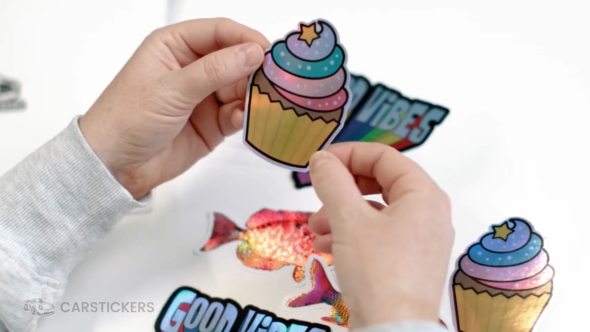
Just like summer festivals, fall and holiday markets are the perfect place to sell custom stickers featuring your artwork, logo, or brand. Selling stickers at markets and fairs is a must! They're affordable, easy to display, make great stocking stuffers, and give customers a fun reminder of the market long after the event is over.
Before you place your next sticker order, we wanted to share a few insider tips we've learned after making millions of stickers. Whether you're preparing for your first holiday market or your fiftieth, these small design decisions can make a big difference.
Things We've Learned After Making Millions of Stickers (Hot Takes & Tips)
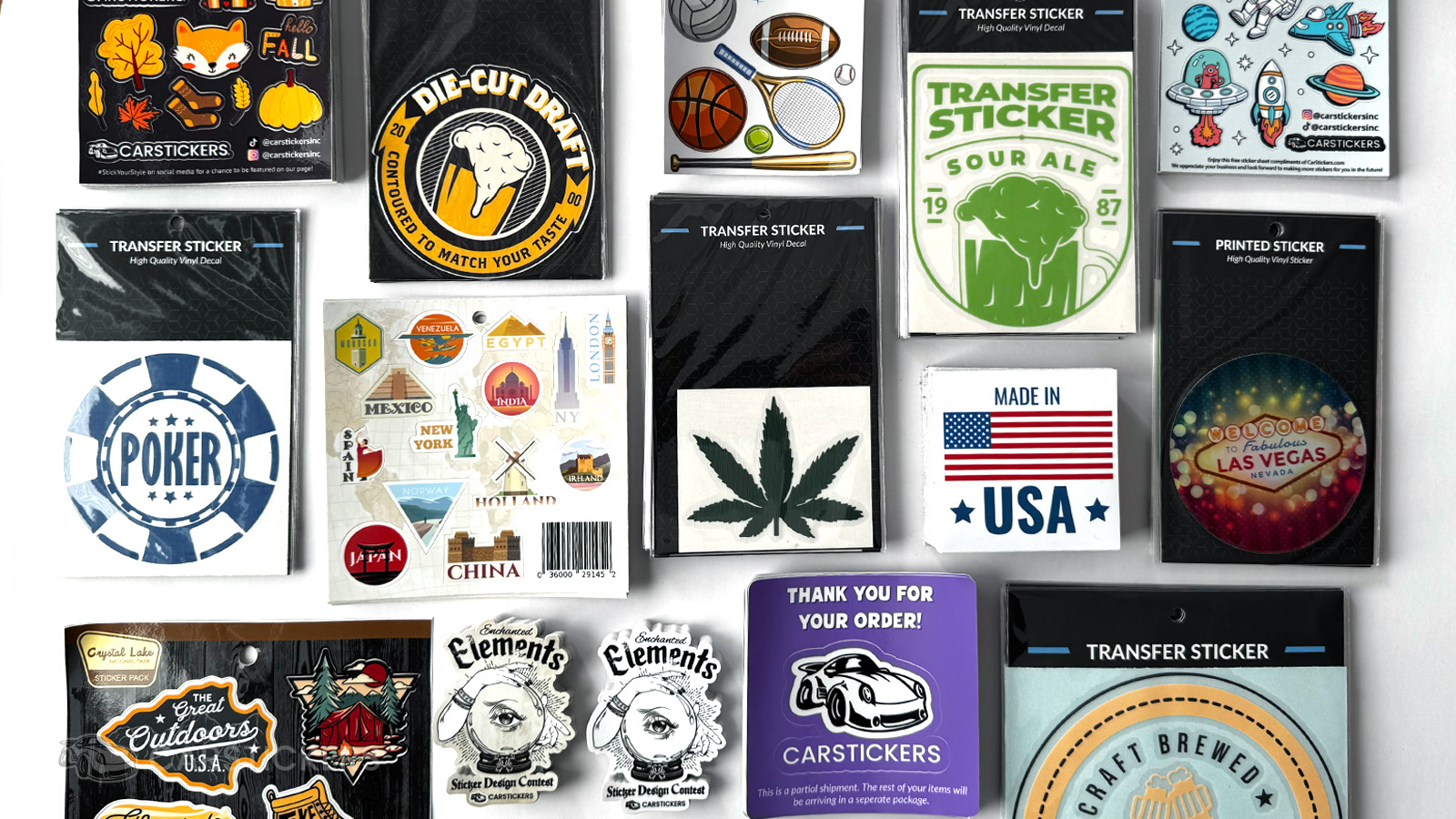
Good design is the backbone of a good sticker. The problem? If you have never worked in the printing industry, there may be a lot of small things you simply don't know because you haven't had the experience.
So today, we are here to help.
We are going to share with you all of our CarStickers insider secrets. Just kidding, that was dramatic.
But we are going to give you some expert tips on how to create better designs for stickers and decals so that you can make the most of your sticker orders and get your brand market ready for fall & winter sales.
1. Tiny Text Issues: Make the Text Bigger Than You Think
We get it.
You want to include your:
- Website
- Phone number
- Ingredients
- Mission statement
- Copyright notice
The challenge is that stickers simply don't have much real estate.
If someone has to squint to read it on your screen, chances are it won't be readable once it's printed. We recommend always sticking to 6 pt or larger for your text size. If you're unsure, we recommend printing various lines of text at 6 pt and above on a piece of copy paper so that you can see the difference before ordering.
Instead of trying to include everything, prioritize what's most important and let the rest live somewhere else, like a QR code. Not sure how to add a QR code? You can easily add one using the CarStickers design tool.
2. Matte vs. Gloss (Matte Is More Popular for a Reason)
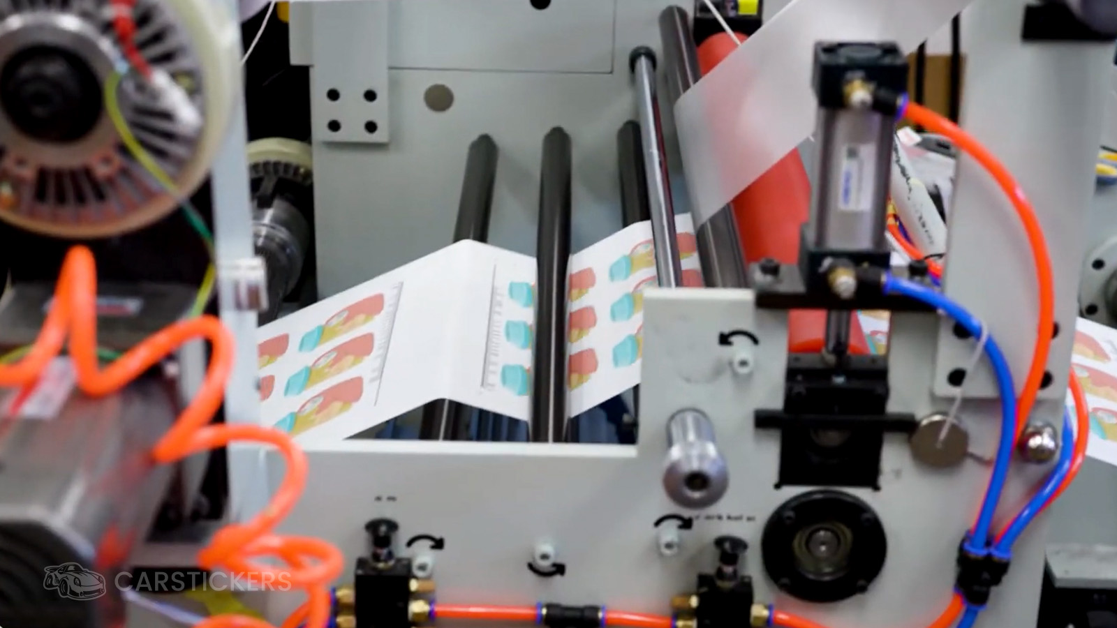
Here at CarStickers, we offer matte and gloss lamination. Both of them protect your design from fading in the sun, keep your sticker protected from scratches, and make the sticker waterproof. When choosing which one you want to order for your sticker, there are a couple of differences.
Matte finishes reduce glare, photograph beautifully, and tend to hide fingerprints much better than gloss. In recent years, matte has definitely been the more popular choice between the two. In a world where everything is content and a lot of stickers are being photographed and used in videos, this is a big reason why matte is so popular.
If your stickers will be handled frequently or displayed under bright lights at markets, matte can be an excellent choice. Ultimately they are both the same quality, and we offer free lamination here, so it's really up to you in the end.
3. QR Codes Need Breathing Room (Black on White Is Preferred)
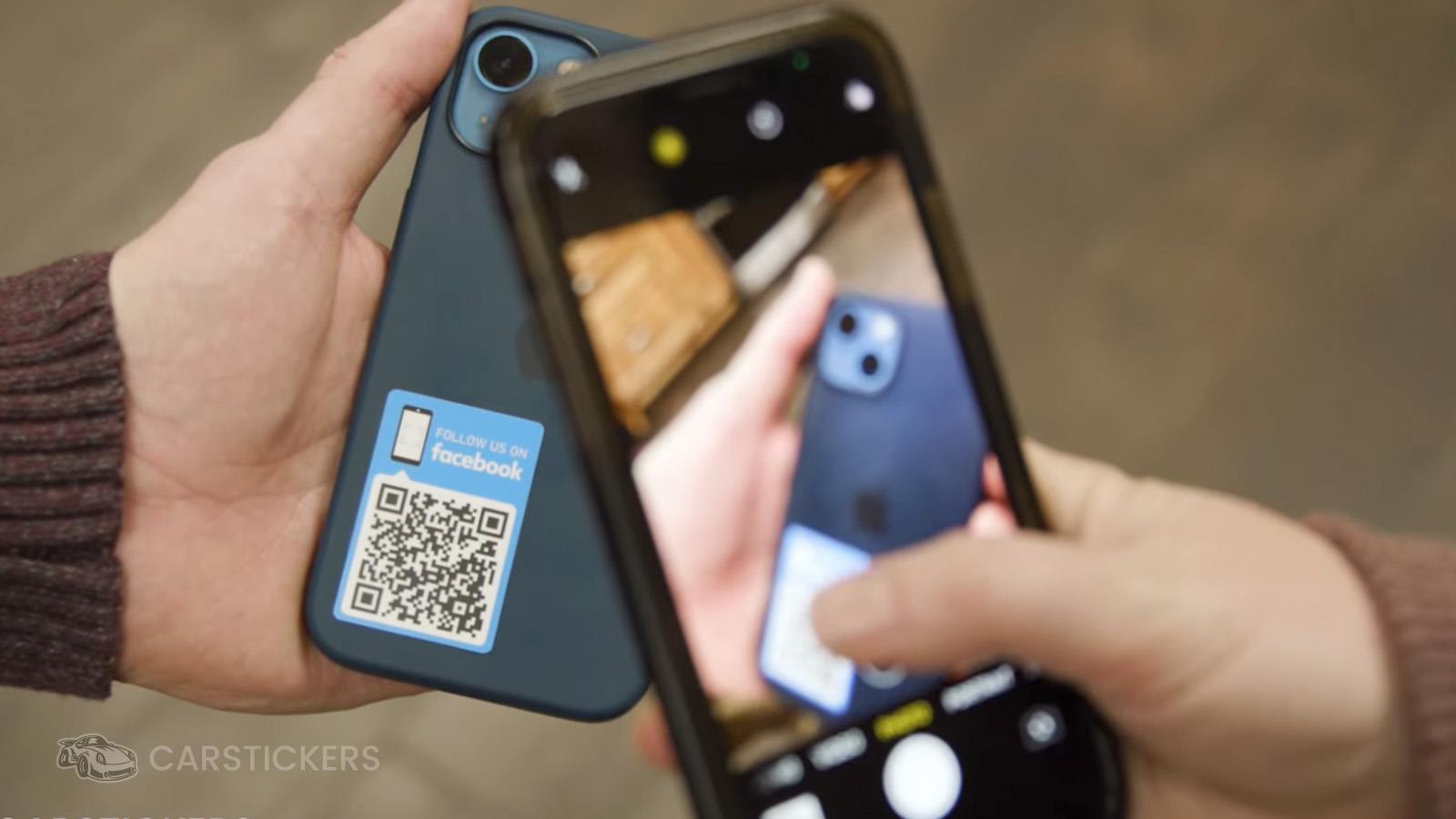
QR codes have become incredibly popular over the past few years, and for good reason.
They're an easy way to connect customers to your website, menu, portfolio, social media, or online store.
One thing we've learned?
Don't crowd them.
Leaving a little extra white space around your QR code dramatically improves scan reliability.
And always test your code before placing your order.
Pro Tip
Dark QR codes on light backgrounds are easier for a phone camera to scan than a dark background with a white QR code.
4. Bigger Isn't Always Better
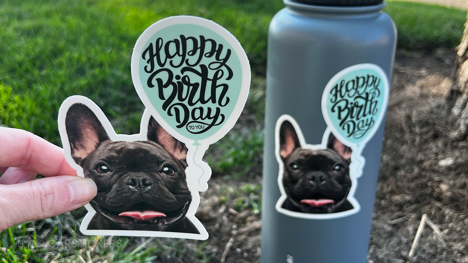
A giant sticker sounds exciting...
...until nobody knows where to put it.
Smaller stickers often get used more frequently because they're easier to apply to water bottles, laptops, notebooks, coolers, helmets, and phones. Think about where your customers will most likely want to put their sticker before you order.
Sometimes a 3-inch sticker ends up getting far more impressions than an 8-inch one.
5. Simple Designs Age Better
Design trends come and go.
Clean typography.
Strong contrast.
Simple illustrations.
These things tend to stay timeless.
When in doubt, remove one more element.
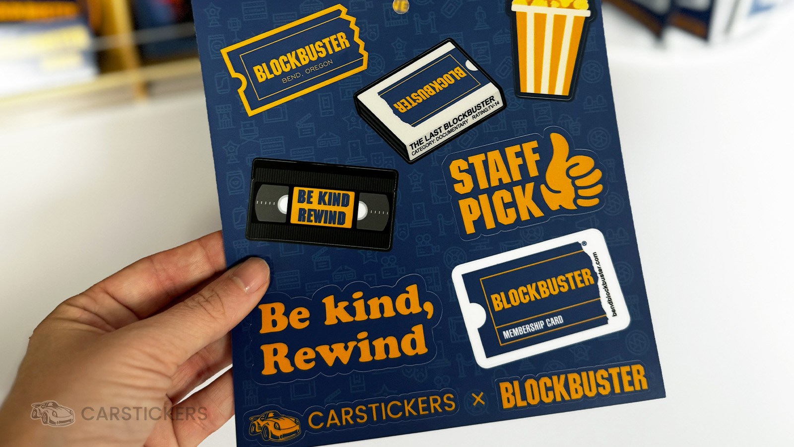
Simplicity is one of the biggest reasons some brands become instantly recognizable. Take Blockbuster, for example. Their logo doesn't rely on intricate illustrations or dozens of colors. It's clean, bold, and easy to spot from a distance. The above image features a Blockbuster X CarStickers collaboration sticker sheet, designed by Jordan Morrow. This sticker sheet works for the same reason: each sticker has room to breathe, the artwork is easy to read, and every element feels intentional. When designing your own stickers, remember that clean designs are often the ones people remember most.
6. Order a Sample if You're Worried About Color
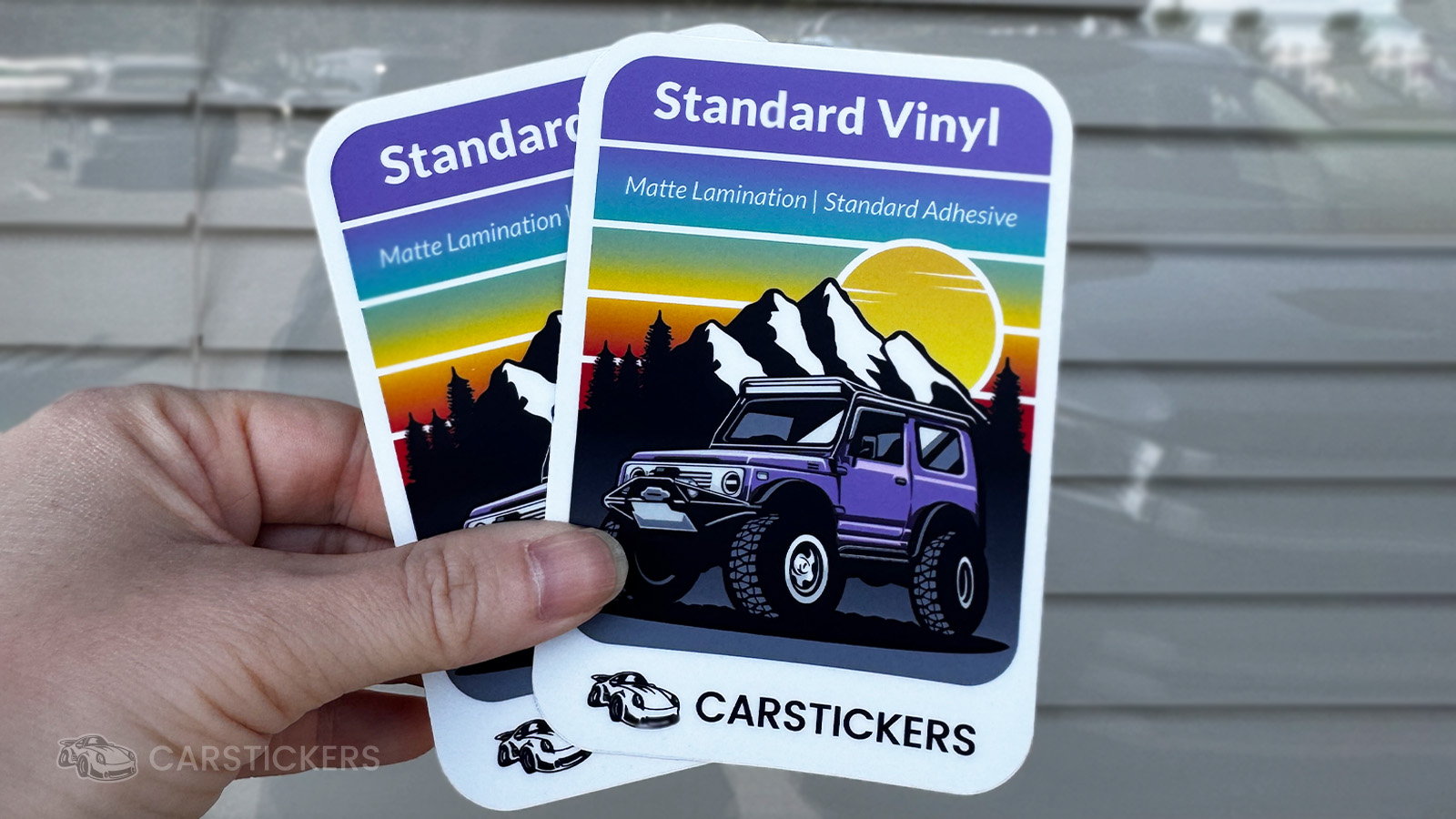
One of the biggest mistakes we see isn't choosing the wrong material. It's trying to imagine what it will look and feel like from a computer screen.
Colors, textures, finishes, and even thickness can feel completely different in person. Colors on your screen also don't always translate the same once they're printed on materials like real wood veneer or holographic vinyl.
If you're deciding between materials or trying to match a specific look, ordering a sample first can save you time, money, and second-guessing.
Whether you're comparing matte and gloss, exploring specialty materials, or testing a new project, seeing the material in your hands is often the easiest way to make a confident decision.
7. Die-Cut Isn't Always the Best Choice
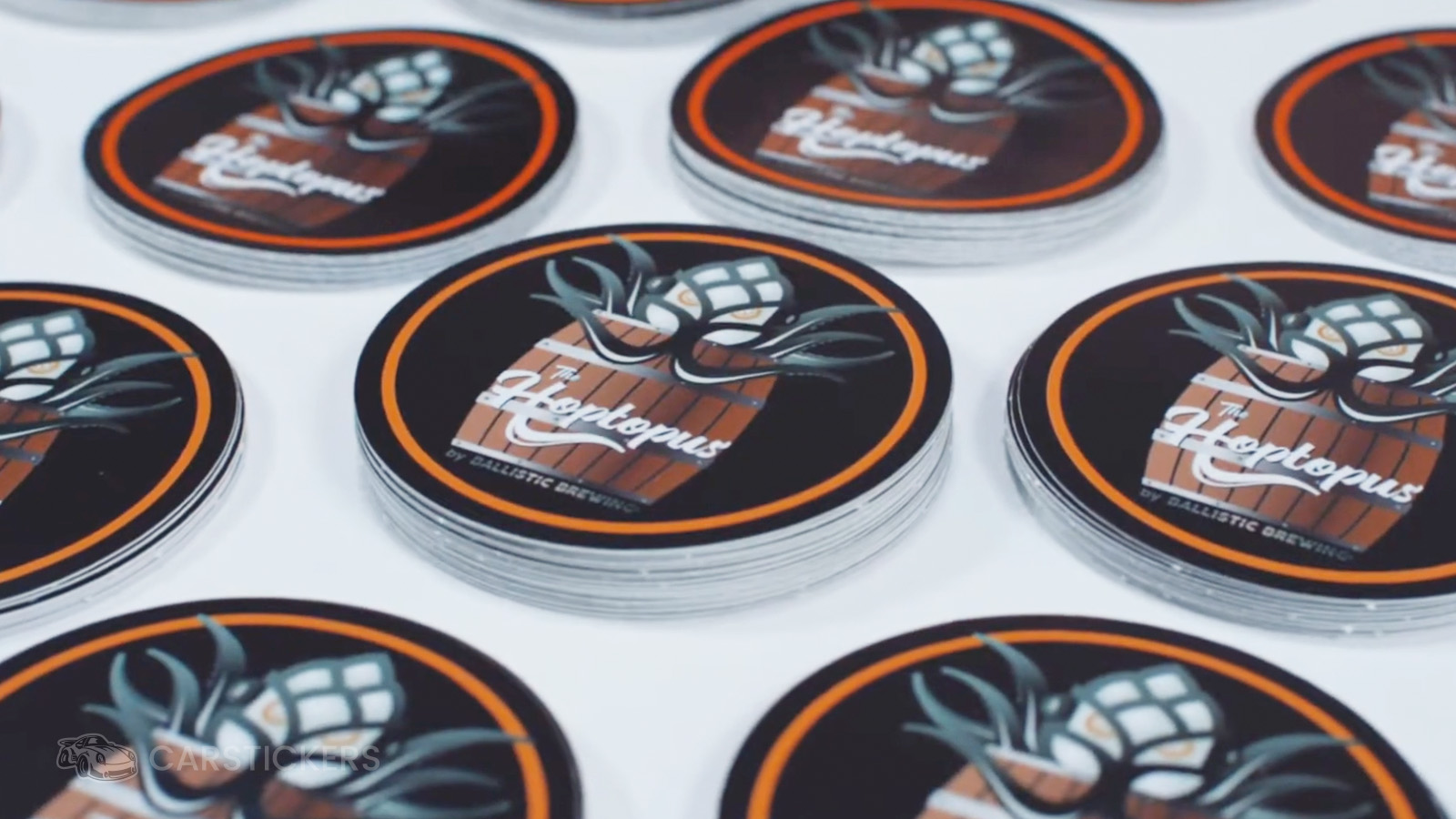
When people think of custom stickers, they usually picture a die-cut sticker. While die-cut stickers are by far our most popular option, they're not always the best fit for every design.
Sometimes, a simple shape like a circle, square, oval, or rounded rectangle can actually make your artwork stand out even more.
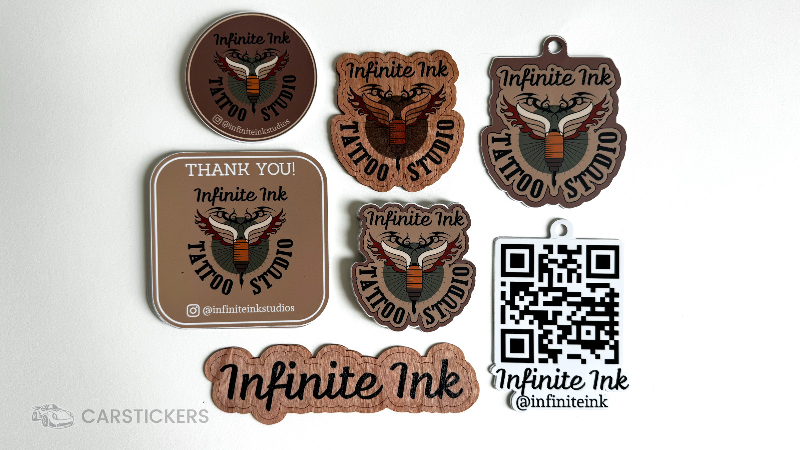
For example, if your logo or illustration is already fairly detailed, placing it inside a clean geometric shape can make it feel more polished and easier to recognize from a distance. Shapes can also provide extra room for text, QR codes, social media handles, or other branding that might not fit comfortably inside a tight die-cut outline.
If you're creating stickers for product packaging, retail displays, giveaways, or event branding, don't automatically assume die-cut is the only way to go. Sometimes choosing a standard shape makes your design easier to read, easier to peel, and even more memorable.
8. Let Color Theory Do Some of the Work
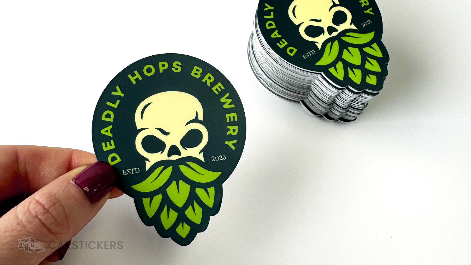
Color isn't just about making your sticker look nice, it can completely change how people experience your design.
High-contrast color combinations, like dark text on a light background, are usually easier to read from a distance. Complementary colors can help important elements stand out, while limiting your color palette can make your design feel more intentional and professional.
One simple trick our design team uses is to avoid making every element compete for attention. If everything is bright and bold, nothing stands out. Instead, choose one focal point, whether it's your logo, illustration, or message, and let your color choices naturally guide the viewer's eye there.
If you're using the CarStickers Design Tool, our Similar Colors feature can also help. It automatically suggests shades, tints, tones, and complementary colors pulled directly from your artwork, making it easy to build a cohesive color palette without needing to be a design expert.
9. Think About the Customer Experience
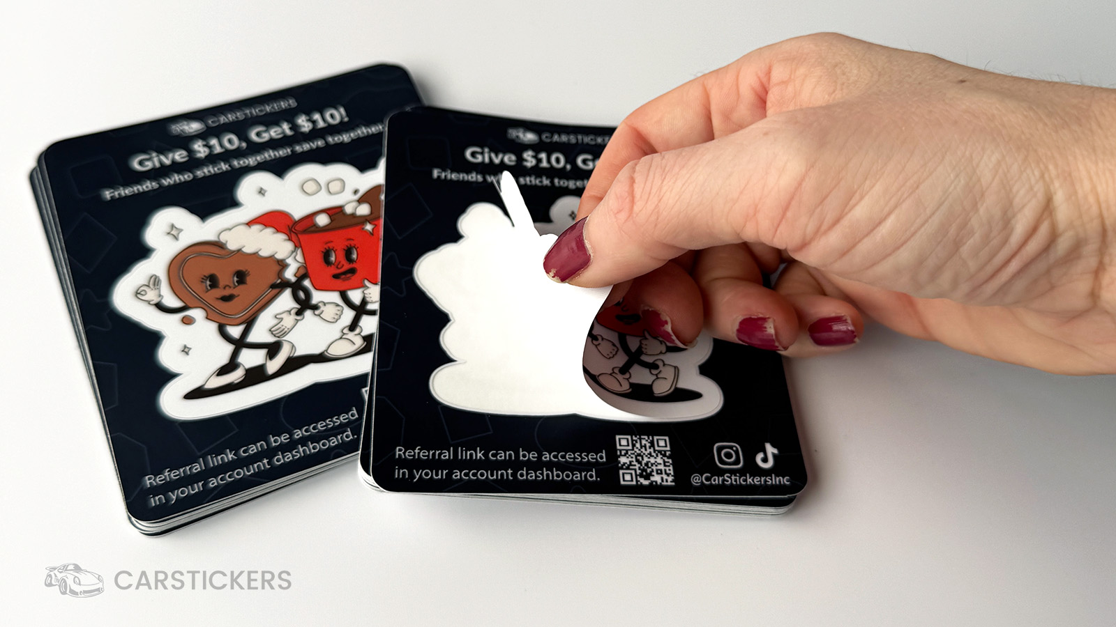
One of the most overlooked parts of sticker design isn't the artwork.
It's how the sticker feels to use.
Would split backing make it easier to peel? Would a kiss-cut backing make it more retail friendly? Would a hole punch help your display? Always make sure to choose the right backing for your design as well as your intended consumer.
Sometimes the little details make the biggest difference.
10. Add More Value with Printed Backing
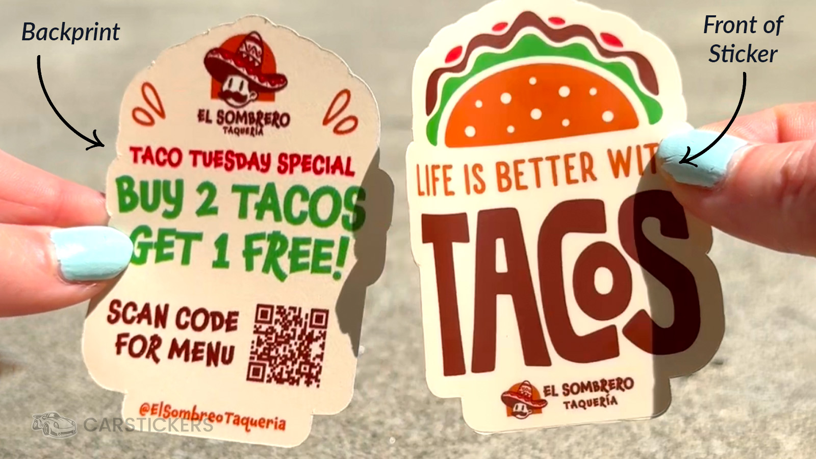
Most people focus entirely on the sticker itself.
But your backing liner is valuable space, too.
You can print:
- Your website
- Social handles
- Coupon codes
- Product instructions
- Another design
- A thank-you message
It's one of the easiest ways to add value without changing the sticker itself.
Ready to Create Your Stickers?
As we head into the busiest selling season of the year, now is a great time to revisit your sticker designs.
A few thoughtful changes, whether that's choosing a different backing option, simplifying your artwork, or adding a QR code, can make your stickers easier to use, easier to sell, and more memorable for your customers.
After making millions of stickers over the years, one thing has stayed the same:
Great sticker design isn't about following every trend. It's about creating something people are excited to keep, share, and stick. Start making custom stickers and decals that stand out!


